


We at Collector’s Core believe artworks should be chosen for how they speak to you. The artworks you buy and hang for display ought to reflect a personal taste and should be set to last.
Yet, there are several deterrents in making that happen. When hung at your home, the piece might not inspire the same way it did when you bought it. It could be eaten up by the busyness of the room, for example, or by your unusually feral cat.
Now, there are workarounds, many of which don’t involve animal cruelty. One way you can retain the look and ecosystem of your home is by—yes, you guessed it—framing. While the artwork itself is inviolable, frames are not, and are often switched to present old works anew or to inject the curator’s or collector’s sensibility. It can also be done to coordinate a piece with the room’s décor.
Take it with a grain of salt, though, when someone tells you there aren’t any “hard and fast rules” for framing. It’s not untrue, but a mindset like that can lead to several unnecessary detours going in and makes it awfully difficult to start. Here’s a guide that can help narrow down options before committing to a specific look.
Assess the Work
First off, measure the dimensions of your artwork-to-be-framed and include the borders. Depending on your framing option, the resulting measurement may be used directly for a classic frame, or the set dimensions for an interior mat window or mount.
Next, take note of the material and medium. If it’s oil or varnished acrylic on canvas, panel, or board, it’s simply a matter of choosing a frame.
If it’s an artwork done in pastel, watercolor, or is a drawing in pencil, charcoal, or graphite, however, it’s vulnerable to light damage and moisture. Other organic and perishable mediums fall under this category, too, including photographs and prints on paper.
In cases like these, there’s just no getting chloroplast it. Such delicate artworks need to be protected by UV and infrared shielding glass displays. Often slipped between this type of artwork and glass is an acid-free mat, essential for art preservation to avoid moisture build-up. There are several ways to work matting to your aesthetic benefit, however. Before covering tips on framing in general, it’s best we tackle some of the more popular styles around.
Mats, Floating Mounts, and the Full-Bleed
When it comes to these styles, the keyword is “acid-free” for conservation: acid-free adhesives, backing, mats, these all help prevent moisture. The artworks should also be hinged at the upper two corners, as paper can flatten.
Matting has been a staple for prints and photography and is a great way to match smaller or unusually sized artworks with larger or stock frames. In general, the mat window helps set a smaller work apart, giving it ample breathing room while also directing the eye to it.
For composition, the size of your mat board ought to be 2–4 inches larger in length and width than your artwork. The resulting size is also the dimension of your outside frame. For the mat window, on the other hand, the inner cutout has to be a quarter (1/4) inch smaller than your artwork’s size. The overlap ensures a decent fit.
For smaller artworks (up to 26 x 30"), keep the mat border at two inches; for larger ones, dare for four. Of course, feel free to play around with these measurements. If you’re feeling particularly creative, you can try for asymmetry in your mat border to pull off an off-centered look.
Another neat trick is to change up the color of your mat to tone down or heighten the art according to the color wheel. You can also stack up to three layers of different colored mats to accentuate other aspects of the piece.
Opposite is the floating mount, where the print rests on top of the matting instead. Where matting compliments with texture, the floating mount highlights the texture of the work itself, making it ideal for artworks with uneven edges or unique media or cloth.
Finally, we have the full-bleed style, perfect for large prints with enough negative space as it is. This does away with the window and matting entirely, with its frame covering a slight margin around the print itself.
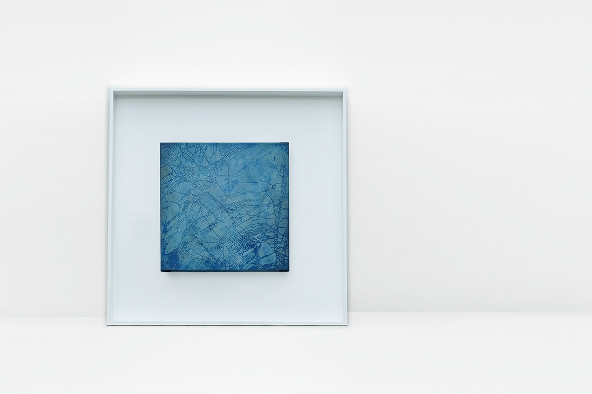
Framing
After having figured out the artwork size, medium, and have some ideas for an appropriate style, we can finally get down to choosing a frame, which is where “no hard and fast rules” apply.
Your eventual choice of frame is up to you, the best way to start, though, is to take a cue from the artwork itself—particularly, what of it you want enhanced or toned down. Here are some final pointers for reference to cap things off. Good luck!
- Traditional artworks, like a portrait or detailed landscape, do well with thick, lacquered wood
- Abstract and conceptual works work with subtle, geometric frames or a floater frame
- A sloping frame focuses on the artwork
- An ornate frame balances the art out by drawing attention to itself
- Thinner frames go with smaller artworks; thicker frames go with larger ones
- For paintings, go with frames that provide contrast and set a border for the work
- For prints and photographs, match the frame with a dominant or secondary color
- When in doubt, try black, white, or the shades in between
- When helplessly in doubt or sick of convention, try for a stretched or unframed canvas (for large paintings and photographs)
- Make sure the artwork is sealed airtight in the frame to avoid environmental pollutants that can nudge itself in over time