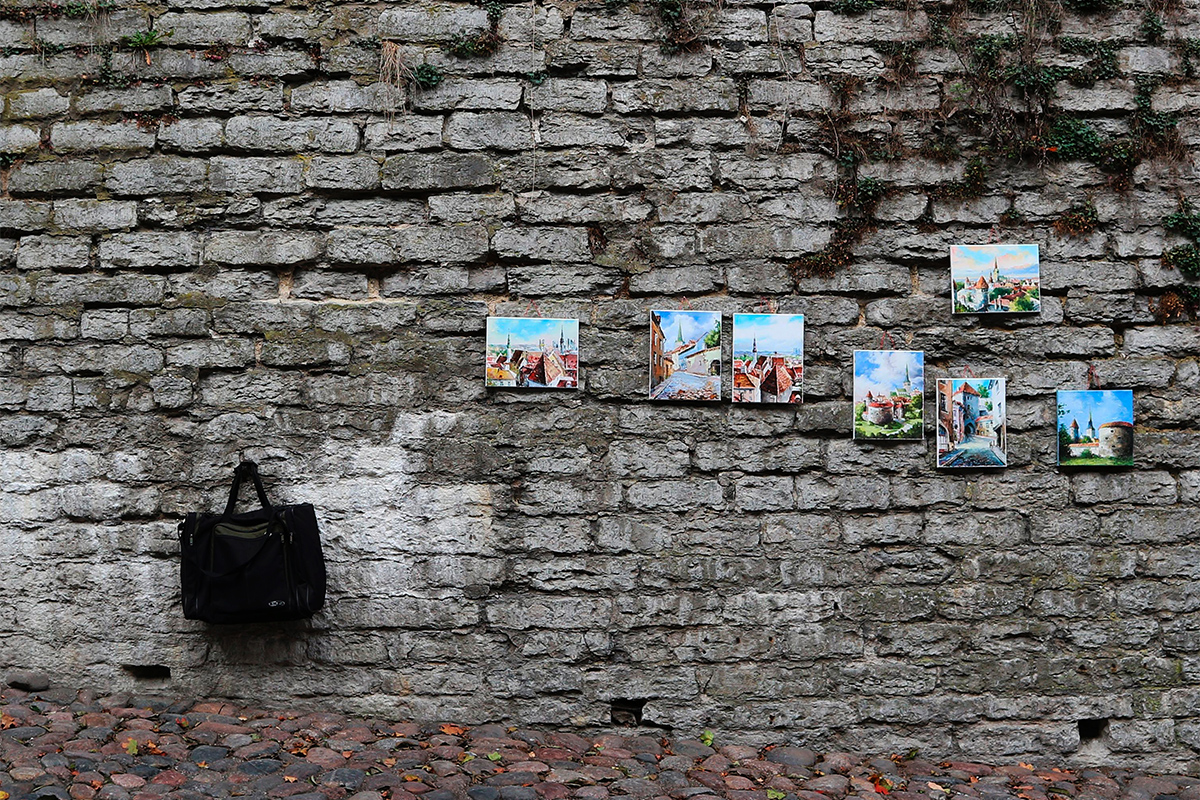
The salon-style dates back all the way to 17th century, France, coined after the private exhibits held at the Salon Carré. As it was meant for quick, cursory viewing, the most noteworthy artworks hung at eye-level, while the rest received a more haphazard treatment, filling every square inch of wall from floor to ceiling.
Thankfully, the salon-style today is far more accommodating, and you can start with as few as five artworks to complete your room. It’s a relaxed, flexible style, allowing for an eclectic mix of works to hang together without having to worry over framing, size, or symmetry all too much.
While that may invite the prospect of hanging a sensual self-portrait next to motivational cat posters and by a tiki torch, for whatever reason, hold up. The caveat to this freeing style is that your grouping can go from “considered” to “arbitrary” in a pinch.
Designing your salon takes time and a lot of prep. What matters is the display’s cohesion: how the works interact and come together as a visual whole. Standing before a blank wall can be daunting for anyone, so it helps to note that it’s always a work-in-progress; you can switch things up as your sensibilities and collection grow over time.
Choosing your artworks
It’s likely you already have a good idea of what to hang going in. Whether or not you’re decided, your choices may change as you read on. Before we get started, though, start tracing the shapes of your initial selection on some paper and make cutouts. No need to go crazy here, any old newspaper or manila paper would do. What matters is that they’re all labeled with their dimensions and names for quick reference.
Because the salon-style allows for so much variation, it’s best to start assessing which artworks really speak to you as you trace them out. Depending on the size of your collection, you may choose as many as you want. These will be the focal points of your cluster that would anchor the rest. They don’t necessarily have to be your largest works; you can choose also by the way their colors pop.
In other words, they’ll take up areas of interest in the grouping and inform the context. Should there be more than one, set aside also works that share traits of at least two focal points.
Choosing your space
If you’ve read Chesca’s guide to protecting your collection, there isn’t much to say except that the tiki torch thing probably isn’t going to happen. Hanging artworks near fluctuating sources of moisture and heat are prone to damage, no matter your framing.
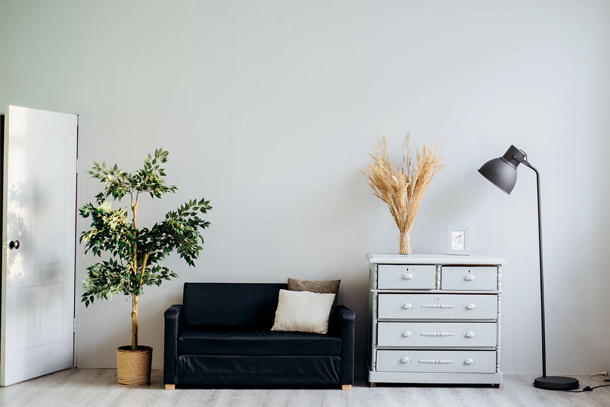
In any case, it’s essential to take the larger context of your surroundings into account. The salon-style display adds that personal touch to complete the room’s look, not so much start it.
The display should blend with the existing colors and rhythm, so working in an already furnished room is ideal. It’s easier to decide how many artworks ought to be hung, too, as well as what. For example, you wouldn’t want to hang something like Goya’s Saturn Devouring His Sons above your grandfather’s urn. That’s just spiteful.
That said, hanging art in an overstuffed, low-ceilinged room may not give you or the works ample room to breathe. Depending on your display’s eventual layout, also, you may want to keep it visible for viewers or yourself to appreciate it from different angles. Here are some quick additional tips courtesy of ArtSpace:
- For hanging above a piece of furniture, consider artworks between 65–85% of the furniture’s total width
- For an empty wall, multiply the length of your wall by 0.57; the result is the ideal width your grouping ought to have
These rules aren’t strict. Factors like how high your ceiling is may call for some creativity.
Deciding on the layout
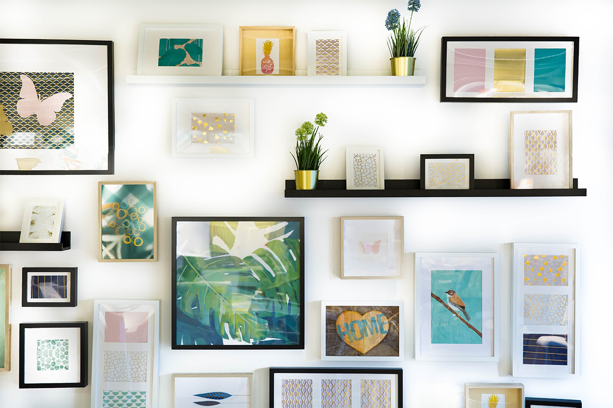
Unlike grids or linear displays, the asymmetrical grouping of the salon style provides a more personal feel to an already eclectic ensemble. Now that you have the general width figured out, it’s now a matter of spacing and alignment.
Uniform spacing in between varying sizes of works is a great way to keep a geometric rhythm. Anything from 2-5 inches should do. Keeping the spaces consistent allow for more variety with your frames. While differing frame margins shouldn’t be much of a problem, avoid crowding the thicker ones when you get to arranging.
Another neat tip is to work with the horizontal line, hanging your works to end a few inches above or below it. The tried-and-tested way to find it is figuring out the eye-level, which sits at a global standard of 58 inches from the floor. If you’re sick of math, you can also estimate it by choosing a point between waist and chest level.
For the vertically gifted, your level may vary compared to others. I imagine that can be quite lonely. That’s okay. You have enough good things going on as it is.
Piecing it all together
Tape your cutouts onto the wall beginning with your focal piece at eye-level. Avoid taping a work in the exact center, especially if you’re gunning for an asymmetrical composition with several focal pieces. Remember that you can play around with where your focal points end and begin along the line.
From there, create clusters with your other cutouts, moving away from the focal point and toward the edges of the wall. Use the middling artworks you set aside to blend two clusters of two different focal points together.
A great thing about taping these cutouts is it lets you pinpoint where to drill a hole without commitment. Assuming the works are wired, it’s important to find the drop height. To do that, pull the wire all the way up. The point where there’s no more slack is where the nail or hook ought to be. When you finally get to hanging, remember to keep all artworks flat if you can help it.
All these so far set the ground for what artworks ought to be hung for internal consistency: composition, spacing, alignment, and grouping. The outward visual appeal is another concern altogether. In the event you follow these guidelines to the letter, it may still be that your nude self-portrait may not work with your alarming number of cat posters. But hang in there!
Traditionally, people would lay their artworks on a floor and shuffle things around until they arrive at a nice visual flow. If you have such a sizable floor or are incredibly tall, then by all means, do it. An alternative is to mess around with the arrangement digitally through photoshop. Don’t feel discouraged. This is the best time for you to trust your gut and get creative with your display.
Anyhow, here are some more tips and tricks to remember:
- Arrange according to a specific theme
- Similar finishes on your artworks help with cohesion
- Using the same frame for all your artworks is too on-the-nose; limit it to types of three if you can
- Use the color wheel to group works according to a palette (don’t forget to include the color of your wall)
- You can always switch the smaller frames before or after decorating your art wall
- Experiment, experiment, experiment!
No matter what, remember that it’s a work in progress. If you need more art for your display, we may have something for you at the shop!